Charts
How chart configuration works
Chart configuration in Minyu is defined as a hierarchical specification model. High-level configuration defines the coordinate system and rendering context, while lower-level nodes define axes, series, labels, and interaction behavior.
The coordinate system establishes how data is spatially interpreted:
- Cartesian – line, bar, scatter, effect scatter
- Polar / Radial – radar, sunburst
- Non-axis – pie, tree, treemap, funnel
Certain chart types require axes, while others operate directly on proportional or hierarchical layouts. Within a Cartesian system, multiple heterogeneous series may be rendered simultaneously as long as they share compatible axes.
This model allows:
- Uniform configuration of simple and composite charts
- Shared axes across mixed series types
- Overlaying independent analytical representations in the same coordinate space
Example: A Cartesian configuration may render monthly sales as bars while overlaying a cumulative trend as a line series, both bound to the same x- and y-axes.
Live preview of configuration changes
The chart editor is split into:
- A live preview renderer
- A configuration tree
All changes to the configuration tree are applied immediately and synchronously to the preview.
This enables:
- Real-time verification of axis mappings
- Immediate feedback on legend placement
- Validation of series compatibility
- Rapid iteration without persisting intermediate states
The preview always represents the exact render state implied by the active configuration tree.
Common configuration options
These options apply at the chart root level, independent of coordinate system or series type.
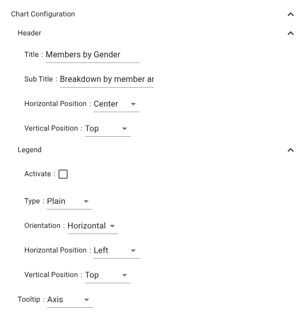
Header
- Title – Primary chart identifier
- Sub Title – Secondary contextual descriptor
- Horizontal Position – Left / Center / Right
- Vertical Position – Top / Middle / Bottom
Legend
Controls legend rendering and layout.
- Activate – Enables or disables legend rendering
- Type – Legend rendering style
- Orientation – Horizontal or Vertical
- Horizontal Position – Left / Center / Right
- Vertical Position – Top / Middle / Bottom
Tooltip
Controls data inspection behavior on hover:
- None – No tooltips
- Axis – Aggregated tooltip per axis coordinate
- Item – Tooltip per individual series element
Cartesian coordinate system
The Cartesian system is defined by two or more orthogonal axes. Typical usage is:
- One categorical or temporal axis
- One numeric value axis
Axis types enforce strict column compatibility:
- Category → discrete fields
- Time → date or timestamp
- Value → numeric
- Log → positive numeric
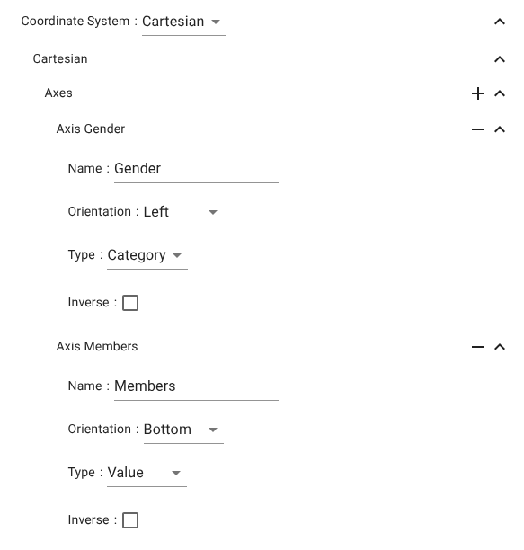
Axes
Each axis is configured independently and later bound to one or more series.
Axis Region
Represents categorical dimensions.
- Name – Axis label
- Orientation – Left / Right / Top / Bottom
- Type – Category / Log / Time / Value
- Inverse – Reverses ordering
Axis Members
Represents numeric or measured dimensions.
- Name – Axis label
- Orientation – Typical x/y placement
- Type – Category / Log / Time / Value
- Inverse – Direction reversal
Example use
A bar chart for members per region:
- Axis Region → Category → Regions
- Axis Members → Value → Member count
- Bar series binds to these two axes
Series
A Cartesian chart supports arbitrary numbers of series, each bound to a valid axis pair.
Axis mapping rules
- Value / Log → Aggregated numeric paths (count, sum, avg)
- Category / Time → Grouping paths
This enforces semantic correctness of all mappings.
Bar chart series
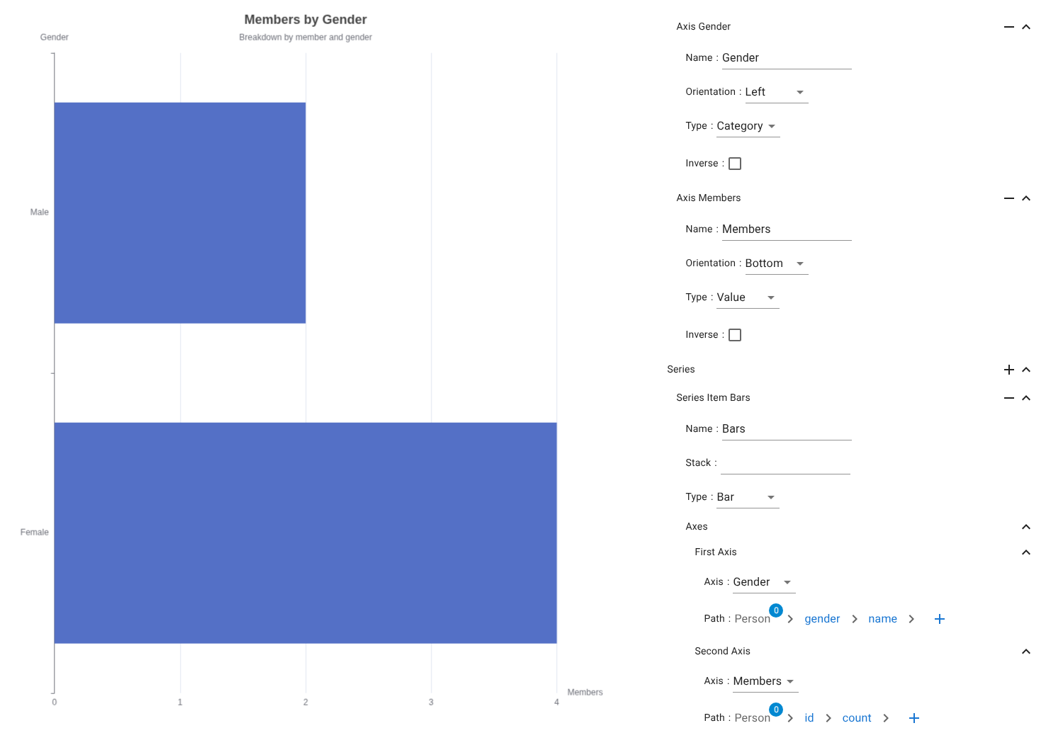
Characteristics
Used for categorical comparisons and distributions.
Series settings
- Name – Series identifier
- Stack – Optional stacking group
- Type – Bar
Axes mapping
- First Axis → Person → gender → name
- Second Axis → Person → id → count
Line chart series
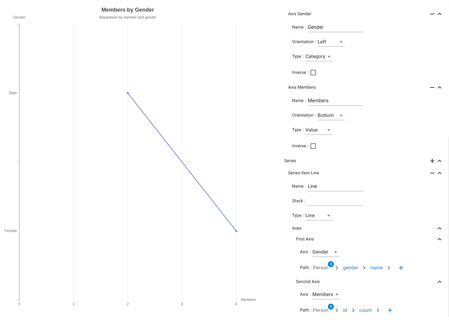
Used for continuous trends and development over ordered categories or time.
- Type → Line
- Axes → Same binding rules as bar
Scatter chart series
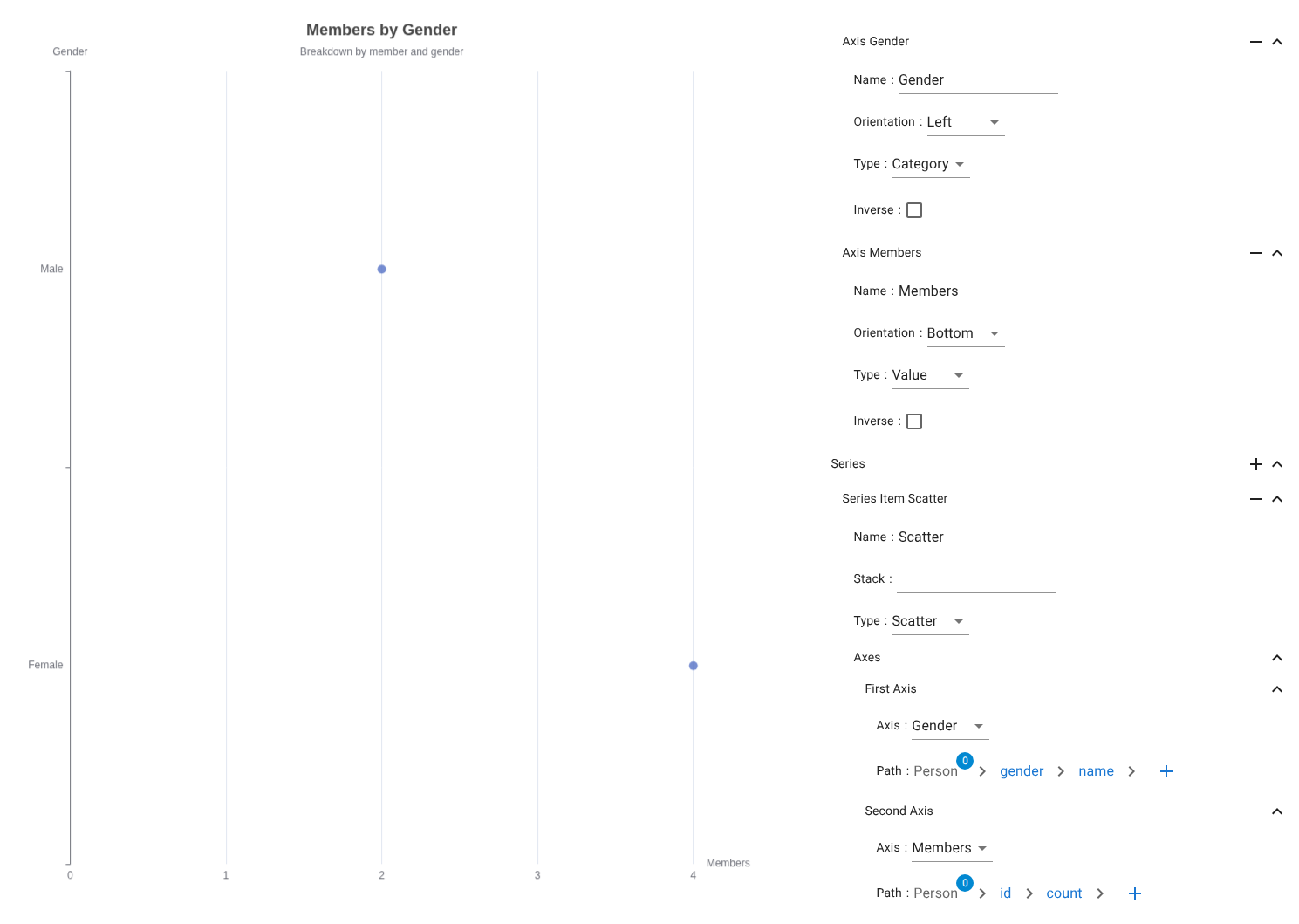
Used for numeric distribution analysis.
- Type → Scatter
- No stacking
- Numeric / categorical axis binding
Effect scatter chart series
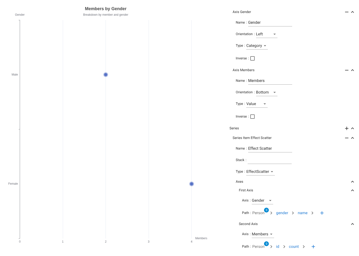
An animated scatter overlay used for visual emphasis.
Typical use cases:
-
Outlier detection
-
Highlighting subsets (Top-N, selected, threshold-crossing)
-
Type → EffectScatter
Non-axis charts
These charts operate without x/y axes and use direct proportional or hierarchical layouts.
Tree chart series
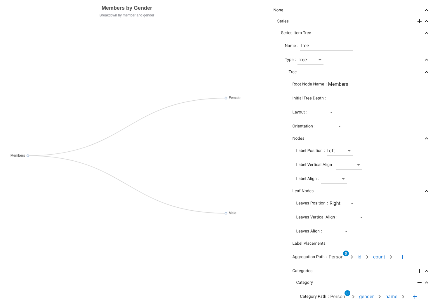
Hierarchical node/branch visualization.
Data mapping
- Aggregation Path → Person → id → count
- Category Path → Person → gender → name
Pie chart series
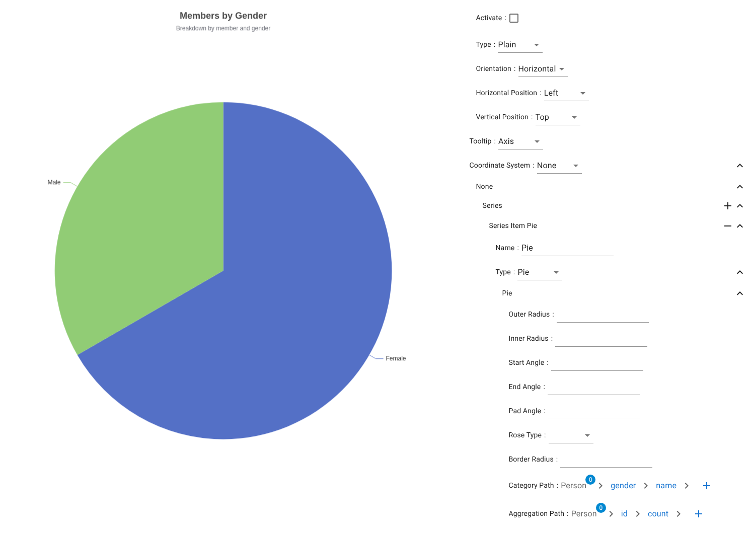
Proportional category distribution.
Data mapping
- Category Path → Person → gender → name
- Aggregation Path → Person → id → count
Treemap chart series
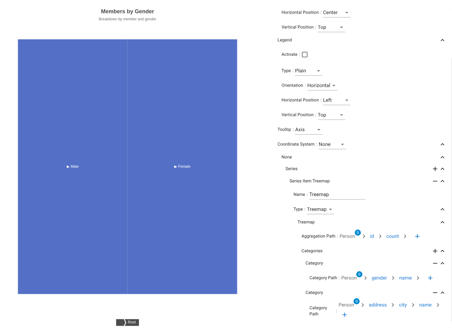
Nested proportional rectangles for multi-level distribution.
Data mapping
- Aggregation Path → Person → id → count
-
Category Paths →
-
Person → gender → name
- Person → address → city → name
Sunburst chart series
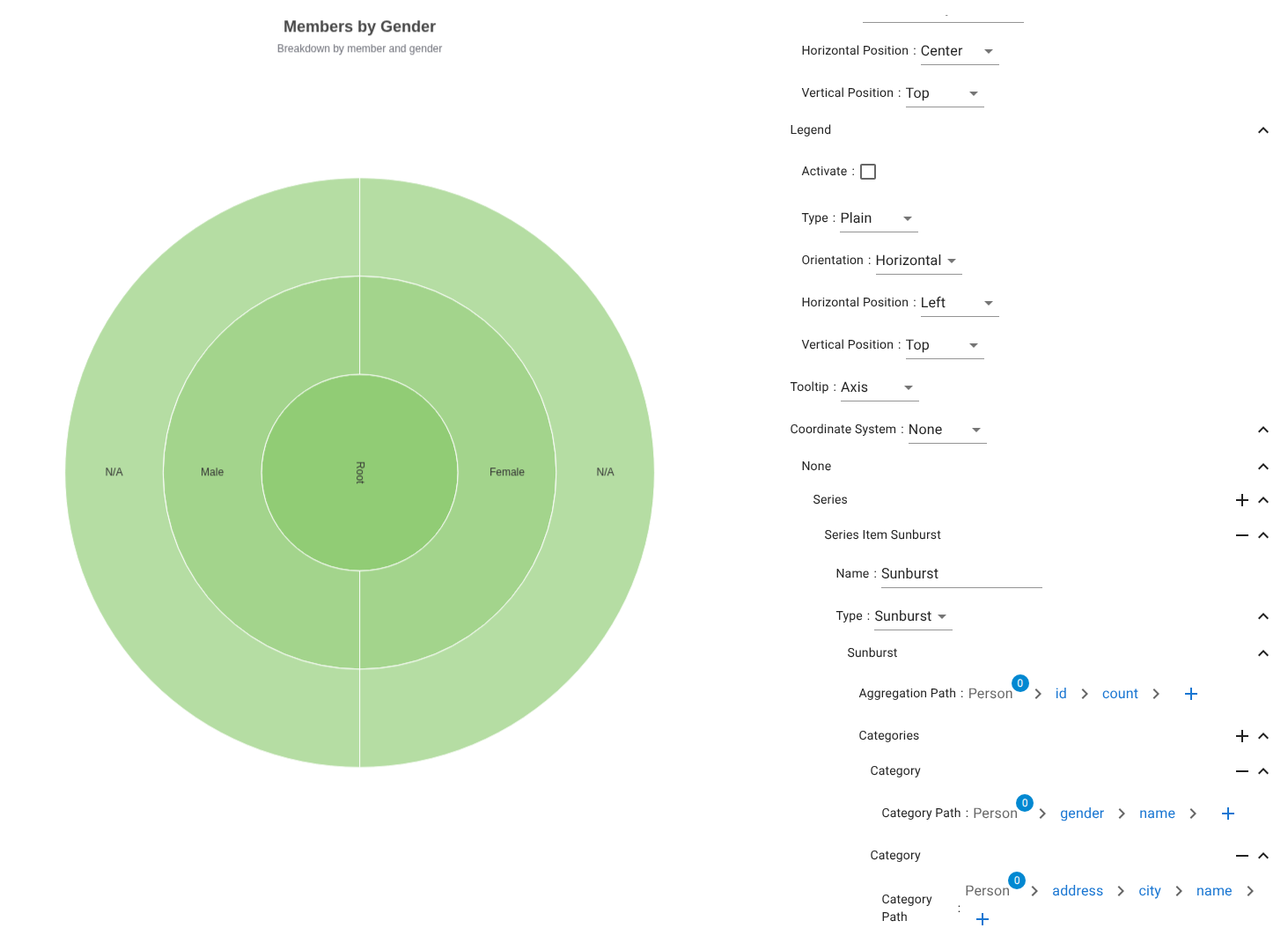
Radial hierarchical distribution.
Mapping rules identical to treemap.
Funnel chart series
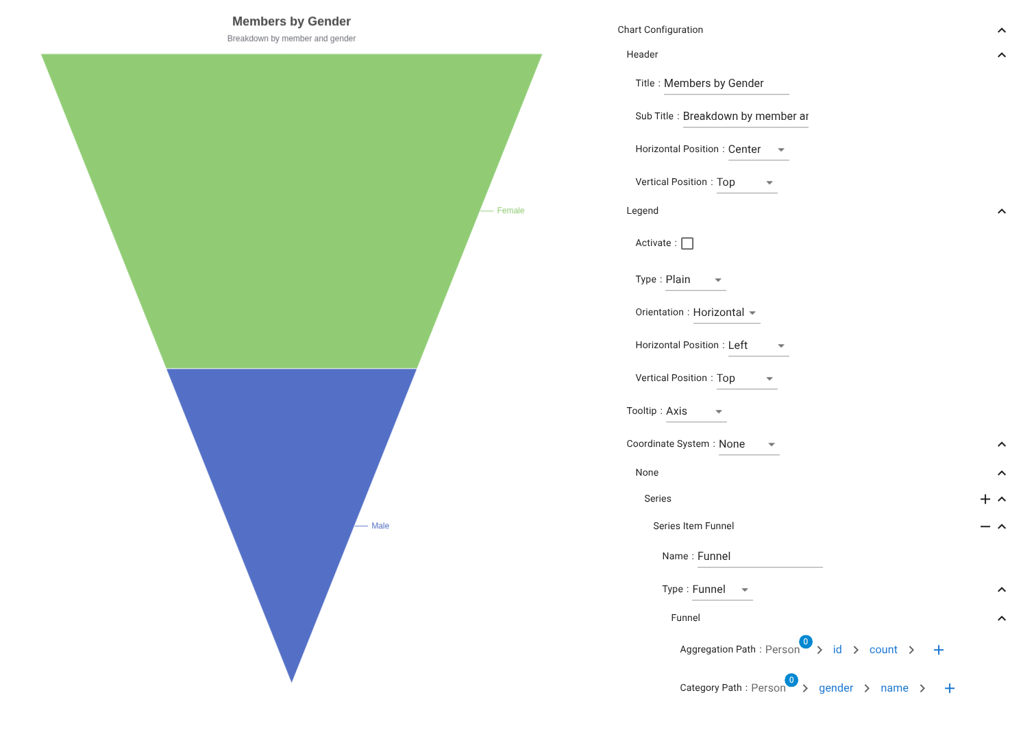
Sequential stage reduction visualization.
- Category Path → Stages
- Aggregation Path → Volume per stage
Radar chart series
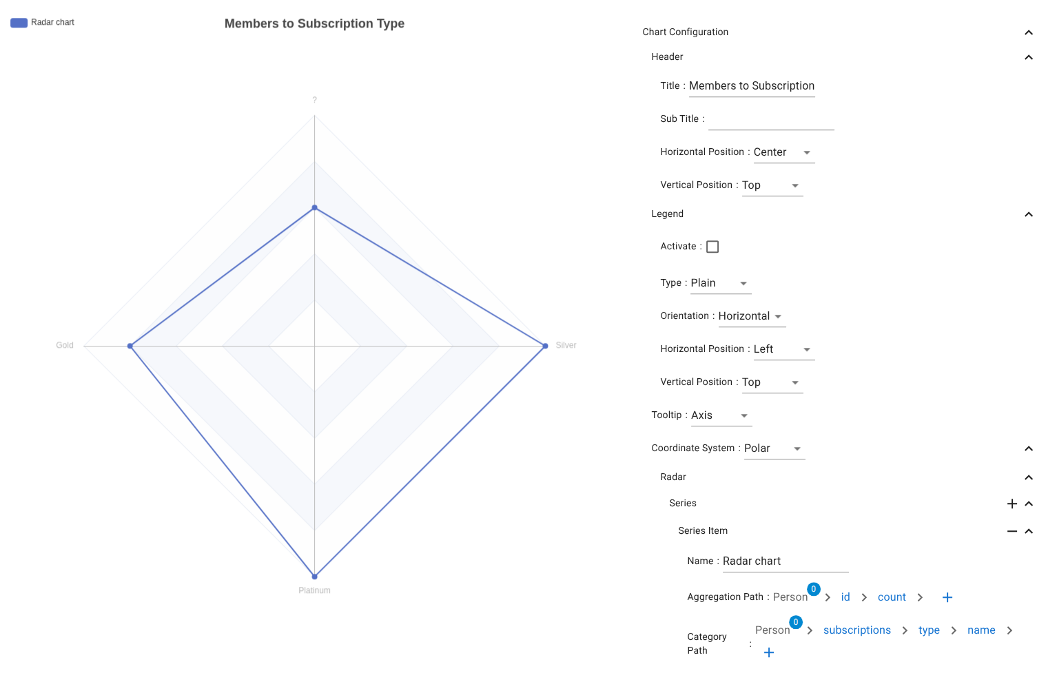
Multivariate radial comparison.
- Category Path → Axes
- Aggregation Path → Values